Important component of building our Brand is a logo, which now has been designed for us by Jules Akel.
I wonder how do you interpret the message of it.
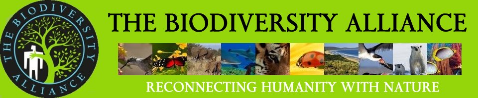
Important component of building our Brand is a logo, which now has been designed for us by Jules Akel.
I wonder how do you interpret the message of it.
You must be logged in to post a comment.
What about animal constituent? Ecosystems? Diversity?
Excellent questions Krishnan. More or less like the same what we were facing with at the beginning of this design process.
So when it comes to a logo design, there are several facets of the task which all need to be carefully considered in order to end up with a usable result.
Firstly, the message, what we want to deliver by the logo, needs to be somehow defined. Now if we look at our core fields: biodiversity, ecosystems, various constituents, each of these are quite a complex phenomena, which are really difficult to depict in a simple way.
Selecting one particular constituent, like an animal, rise the question: why particularly that species has been selected. Well, WWF had selected a Panda, but they had decades and millions of dollars to iron this image in to people’s brain. So we decided not to pick any particular species. Picking more than one is even more problematic purely from graphical representation viewpoint, since the logo should something which is recognizable in size of 100×100 or even 25×25 pixels. Complex drawing can be messy when resized to small thumbnail.
Secondly, our key messages are not really about protecting animals. Our messages are about eliminating the root causes leading to the extinction of animals and plants. And these topics are rather complex equally.
Thirdly, a logo needs to be simple, easy to remember, eye-catching, and optimally possessing the capability of delivering a “story”. Something what we would like to tell our audience.
My interpretation: nature touching the heart of dehumanised humanity. In other words nature reaching us to us, since we have moved away from it, and as a consequence turned into zombies.
Fine with me Janos except that I personally feel brightening the colours up, especially the circle, would make it more prominent.
I agree with your comment to Krishnan. What we need as logo is a message, as powerful as we can make it, and as simple as we can make it. Too cluttered would appear unprofessional. Too many colours would divert attention.
Thanks Ven. Your interpretation is perfect. This logo is aiming to radiate the cry of the nature for help, as it tries to grab humans heart, while humans rigidly turning away from the nature.
I had the same way of thinking about brightening the colors up. But I had to realize that it is a tricky area. Each of the four colors used in this logo has its specific role. The black and white deliver the contrast between humans and their environment. The black is dark indeed, just like the situation is. The green is for the nature, the blue suggests the ocean and/or the blue sky. Changing any of these colors destroys the balance and makes the effect of the whole image much less dramatic.
After having seen plenty of different color combinations we arrived to the conclusion that this is the strongest one, which was the original proposal from Jules by the way. It does not deliver too much optimism indeed, but once you saw this logo, it is difficult to forget. At least for me it left strong footprint in my mind.
I would prefer a plain background ( for the simple reason that in print it will be clear) and contrasting letters. Figures can be green.
Thanks All. As Janos said there were many different colour options tried by Jules, white backgrounds, blue, various letter colours including different ones for each word. In the end the one that stood out as most powerful is the one above. Ven you were right on the mark, as that is what it said to me too. Nature still hasn’t given up on humanity despite our terrible, destructive behaviour.
Janos did ask Jules what the opposite might be ~ the man turning to the tree and perhaps softening himself a bit. I like it. Mike 🙂
If the logo has already been approved , I have nothing to say, except that I am not in favour of it. I feel, it is not comprehensive .
It has not been formally approved, instead it had been selected as the one delivering the strongest message, among the various color variations. I didn’t and do not expect that everybody likes it. There is nothing on Earth what everybody likes.
Generally speaking, you have the following ways to obtain a logo for your organization.
a) Do it yourself. If you have a good idea, you are good in handling graphic designer tools, than you have a chance to get a great logo.
b) Crowd sourcing: You can place and ad on a social media platform or elsewhere inviting volunteer candidates to create a logo. Sooner or later one of them might come up with something what you like and what you want to use. But you have no guarantee whatsoever that it will happen at all. Maybe you keep waiting and get nothing usable.
c) Ask an IT service company, small or large, to design a logo for you. They obviously will charge a certain amount of money, but it is not guarantied that you will like the result. At least you will get something after a certain amount of work, charged by the company. Whether you like it or not, this is another question. They for sure will not work on a trial and error basis to keep delivering countless different designs until you find one you like.
d) Ask a professional graphic designer, who has good references. This leads to higher cost, to more precisely defined conditions about who has to do and deliver what, and to a result within a roughly specified time frame. Still, there is a risk, that you wont like what you will get.
So the questions you might want to ask from yourselves before starting such a project are 1) How important it is for me to have “a logo” within a specific amount of time frame? 2) How much I willing to pay for getting a logo from my own pocket?
Creating a logo is an art. Like composing a music. Or like painting a picture. The artists/designer creates something depending his or her inspiration, experience and skills. Whether you like the result or not is the question of luck at the end.
I think it is very relevant. It tells the very story the planet suffers from. Well, it is not a happy story, instead very contrasting and controversial. The present and the future momentarily is quite dark. This is exactly what it reflects.
It would be better to hear that you like it. If this is not the case, it is also fine for me.
Thank you Janos, well said. I agree that not everyone will like it, but it does tell the current story, and also holds the seeds of hope … that we might yet step away from greed and stupidity. We might not either, so I think the dark and uncaring message is very appropriate.
I did look on Jules’ website and his list of ‘clients’ is impressive. He knows his business and says “we have to market our brand” ~ whatever that may be. He sees that to widen our reach we need a powerful approach. Think where we are right now: 4 of us ~ some of whom post and some do so rarely. We have 19 people who joined the website ~ then nothing and no posts. We also exist legally on paper. That is currently the state of The Biodiversity Alliance.
It can remain like that or we can move it along. Our choice, Mike
Obviously no two persons can have the same taste. I am happy with the LOGO as it is, since I feel it does send out the message we have in mind.
One question : where should we fit the logo on our website. Above the top bar, within the top bar on the right, or where?
This is what we are thinking on with Jules. His first proposal was to move the current top bar somewhere downward and put the logo at the its current place to the top. But we might be able to find better option.
Thanks friends. You can place the logo anywhere you decide. I would not prefer investing my time on it. Yes, the fifth tyre knows what it’s duty is and where it belongs. Posting message every day is not my cup of tea. Neither am I a know all. Environmental policy making is neither in my domains nor have signed any MOU on behalf of my country or any organisation so far. But I know for sure, what the ‘soul’ of a logo is. I know pretty well that when heart speaks brain goes silent — had that been your explanation for the logo I would have gone silent. When you all say that it is immaterial if the fourth man disagrees, it hurts. I am retiring hurt, from the forum that has no time, even to hear me once, why I advocate for a logo that we ourselves develop, not buy one from the haversack of street vendors . Are we that incompetent even to conceive a logo? If, yes , what competence we will have to “save” the earth?. I prefer to be left out – an ant too has its role to play.